Visualization Use Case Part 2: Airline Arrival Delays in the US (Tableau)

After reviewing the flaws of the previous visualization of the DOT Airline performance data in part 1, I created an improved version with the same recordsets. It is a separate viz because the first version have some mistakes due to the number conversion during the csv import. I cleaned up, checked the data and used calculated fields to derive the sum of delays.

Airline Performance in the US 2015

Airline Performance in the US 2015

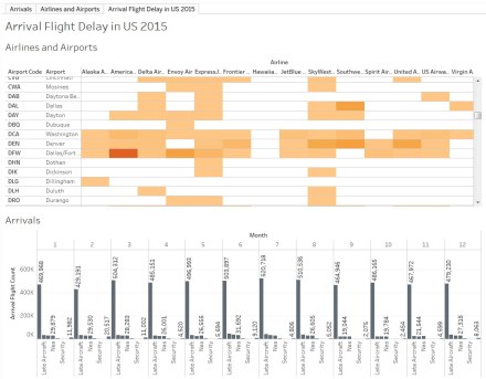
The basic concept is still the same, the matrix on the top left controls the dashboard, initially you see all data for 2015 combined, clicking into cells drills down.
I changed the barchart to stacked bars comparing total to delayed flight in one bar for each month.

Bar Chart

Bar Chart

I moved the split delay reasons into a separate bar chart and added a pie chart which reveals the main reason for delays (surprisingly weather and security have the smalles share!) The 2 lists are a Top 10 style lists highlighting the airports and airlines with the most delays.

Performance

Airport Performance


Performance

Airline Performance


How does the visualization transport information ? Let’s look at the strong and weak points of the second iteration.

+ The key information presentation is improved. We can see the viz is about delays.

 The dashboard starts to look a bit disorganized and the viewer eyes are moving around without a centre of attention.

+ The barchart now makes sense, you can compare total flights and delays.

– The detail delay reason over time does not create too much value as the distribution of reason is quite similar.

Conclusion: Spending more time on both data and visualizations improved the overall impact, though a bit cluttered.

Lets try to apply to some more tweaking..

Visualization Use Case Part 1: Airline Arrival Delays in the US (Tableau)

Going beyond sample datasets and basic visualizations I was looking for open data in my professional domain, the aviation and airport industry. Potential candidates for visualizations are connections, routes, flight plans, airport and airline performance. Performance is usually the comparison of scheduled operations vs. actual milestones. The delay of arriving or departure flights is not only affecting passengers and many parties inside and outside the airport community, but it is driving sentiments, perception and reputation and eventually costs money. This kind of data is not something operators like to release but thanks to the Freedom of Information Act (FOIA), a US Federal law, public gets access to all kind of statistics. From the US DOT (Department of Transportation) you can access and download a variety of datasets, one of them is the On-Time Arrival Performance of US airlines in the US and their delay causes since the year 2003 (link). You can filter by airline, airport and timeframe, review the summary on the DOT website or download the set as CSV for your own analysis. I downloaded the complete dataset for 2015, a 2,25 MB file with roughly 13.500 records.

Arrival Delays in Tableau

Arrival Delays in Tableau


Airline Delays in the US in 2015 by DOT

Airline Delays in the US in 2015 by DOT


It provides total arriving flights, cancelled and diverted flights, the delay count and total time by reason (weather, carrier, NAS, security, late aircraft) for each month-airport-airline combination for 14 carriers at 322 airports.

Airline Delays in the US in 2015 by DOT

Continue reading

D3.js Getting started (again..)

The same questions as some years back: How to get started with it ?

The learning curve for beginners is certainly a bit steep if you dont have a basic background in at least HTML, CSS and JavaScript, in this case you rather go for a visualization tool like Tableau if you look for fast results.
The good news: There is plenty of material out there about D3, books, websites, tutorials. I purchased a couple of books from Packt Books and O’Reilly as PDF version, I think they have the most books, though most of them based on earlier D3 versions.

Packt Books

Packt Books

O'Reilly Books

O’Reilly Books

I wont recommend a specific one, most follow the same principles, a short intro to the DOM, explain the D3 basics followed by more or less complex samples. As with any other technology or programming language you learn most hands-on, there so many examples and good tutorials available. I never attempted to understand everything, understand the concepts, dissect existing visualizations and get creative !

Continue reading

D3.js Data-Driven-Documents Revisited

I came across this fantastic JavaScript library for DOM manipulation in 2011, at that time it was still fairly new in the visualization space and I picked it up for a couple of visualizations moving away from prefuse and other thick client embeded libraries. Now 5 years later, it matured massively and got adopted at large scale. Just recently the version 4.0 was releasey. One of the main features certainly the modularit

D3.js Webesit

D3.js Website and

I will revisit some of the old visualizations I created and also try to convert some newer ideas into visualizations. Now tinkering and playing became much easier, I recommend JSFiddle if you want to avoid local web server setup, though JSFiddle does not support version 4.0 yet (at the time of writing this).

JSFiddle

JSFiddle

You also can run your visualization with the good old GitHub Gist and the bl.ocks site or the browser plugins.

I am working with D3 again after experimenting with visualization tools like Tableau and realizing quickly that outstanding visualizations only can be created with the power of D3, though you have to work with sourcecode and understand whats going on under the hood of a modern web browser. Please dont forget D3 is released under the BSD license !


d3.js – Available Books

D3 is my favourite visualization platform, though the learning curve is steeper because it is about selections, data mapping and transformation close to the DOM. D3 does not come with pre-defined visualizations like bar and piecharts. The website comes with lots of samples and tutorials are available as well. If you take the time to walk through them and experiment by yourself you will learn most. Still I enjoy reading books about technical topics with an end to end walk-through.

Currently there are 2 books about D3 both from O’Reilly and both have a similar introductory focus.

Getting Started with D3

d3a June 2012, 12.99 U$ (ebook)

The books does what its title promises, getting you started, It jumps right into D3 with sample applications and code. What I really like is the fact the author connects the visualizations to real life data (New York’s MTA transportation data) which makes the whole book more entertaining and tangible. It also provides a chapter about transition and interaction, even about layouts which make more exciting visualizations, like those we all know from the D3 websites sample page. Though it does not go into advanced details. At this reasonable price I would recommend the title.

Interactive Data Visualization for the Web

d3b

November 2012, 23.99 US (ebook)

This book is a bit more comprehensive than the first one, it starts with some more basic underlying technologies and provides the reader with an introduction to HTML, DOM, CSS and Javascripts. The chapters covering D3 are written lengthier providing slightly more details. It runs along the sample around a bar-charts and scatter-plots which turns dull after a while.  The early release I have seems to be incomplete, so I dont want to give a final verdict.

With D3 obviously getting more popular we will certainly see more books, hopefully covering advanced features and more visualization centric. I was asked if I like to write one but my D3 knowledge is way not comprehensive enough, I wish Mike Bostock would write one.

Post number 300 ! Thanks to the up to 1000 visitors a day.

d3.js – From tree to cluster and radial projection

Some visualizations seem to be more sophisticated (to implement) than they actual are, specifically the radial projections. Starting from a tree representation with nodes and links it is quite easy to get to the radial version.
Remark: Of course there are more challenging radial diagrams like the bundle, but lets get started with something simple first !

“Standard” Tree
(I added few more nodes to make the visual difference more obvious)

Tree Visualization

We change 1 line of our sourcecode (see previous tutorial for complete code):

var tree = d3.layout.tree().size([300,300]);
to
var tree = d3.layout.cluster().size([300,300]);

Continue reading

d3.js – Most simple stack layout with bars

In order to understand the physics of various visualizations I walk through the samples and gists I find, dissect them and strip them down to the bare minimum. From there I explore my own variations. I took Mike’s sample for a stacked bar chart and changed it to chart reading from a matrix instead of the csv file.

Stacked Bar Chart

The matrix object

            var matrix = [
                [ 1,  5871, 8916, 2868],
                [ 2, 10048, 2060, 6171],
                [ 3, 16145, 8090, 8045],
                [ 4,   990,  940, 6907],
                [ 5,   450,  430, 5000]
            ];

The stack layout expects an object with an array of objects, each member of the array represents the values of one value group (eg. “all dark blue values”), and each object contains x and y value. It will process theis array amnd a y0 value (the offset to the baseline).
You can see this if you run the below code with the console.log output.

Console

<!DOCTYPE html>
<html>
    <head>
        <title>Simple Stack</title>
        <script type="text/javascript" src="libnew/d3.v2.min.js"></script>
        <style>
            svg {
                border: solid 1px #ccc;
                font: 10px sans-serif;
                shape-rendering: crispEdges;
            }
        </style>
    </head>
    <body>

        <div id="viz"></div>

        <script type="text/javascript">

            var w = 960,
            h = 500

            // create canvas
            var svg = d3.select("#viz").append("svg:svg")
            .attr("class", "chart")
            .attr("width", w)
            .attr("height", h )
            .append("svg:g")
            .attr("transform", "translate(10,470)");

            x = d3.scale.ordinal().rangeRoundBands([0, w-50])
            y = d3.scale.linear().range([0, h-50])
            z = d3.scale.ordinal().range(["darkblue", "blue", "lightblue"])

            console.log("RAW MATRIX---------------------------");
	    // 4 columns: ID,c1,c2,c3
            var matrix = [
                [ 1,  5871, 8916, 2868],
                [ 2, 10048, 2060, 6171],
                [ 3, 16145, 8090, 8045],
                [ 4,   990,  940, 6907],
                [ 5,   450,  430, 5000]
            ];
            console.log(matrix)

            console.log("REMAP---------------------------");
            var remapped =["c1","c2","c3"].map(function(dat,i){
                return matrix.map(function(d,ii){
                    return {x: ii, y: d[i+1] };
                })
            });
            console.log(remapped)

            console.log("LAYOUT---------------------------");
            var stacked = d3.layout.stack()(remapped)
            console.log(stacked)

            x.domain(stacked[0].map(function(d) { return d.x; }));
            y.domain([0, d3.max(stacked[stacked.length - 1], function(d) { return d.y0 + d.y; })]);

            // show the domains of the scales
            console.log("x.domain(): " + x.domain())
            console.log("y.domain(): " + y.domain())
            console.log("------------------------------------------------------------------");

            // Add a group for each column.
            var valgroup = svg.selectAll("g.valgroup")
            .data(stacked)
            .enter().append("svg:g")
            .attr("class", "valgroup")
            .style("fill", function(d, i) { return z(i); })
            .style("stroke", function(d, i) { return d3.rgb(z(i)).darker(); });

            // Add a rect for each date.
            var rect = valgroup.selectAll("rect")
            .data(function(d){return d;})
            .enter().append("svg:rect")
            .attr("x", function(d) { return x(d.x); })
            .attr("y", function(d) { return -y(d.y0) - y(d.y); })
            .attr("height", function(d) { return y(d.y); })
            .attr("width", x.rangeBand());

        </script>
    </body>
</html>

My gist: bl.ocks.org/2940908

d3.js Playing with Selections II (flat vs. hierarchy)

Based on the previews experiments you will get a flat array with all selected elements.

d3.selectAll("tbody td");

Selection

Using a chained (nested) selection

d3.selectAll("tbody tr").selectAll("td");

we get matrix of cells

Nested Selection

Now we are in full control and can manipulate eg. the color of specific cells and rows

var td = d3.selectAll("tbody tr").selectAll("td");
td.style("color", function(d, i, j) { return (j<2 && i<2) ? null : "red"; });

Nested Selection

d3.js Playing with Selections

One should have a good understanding of selections, it is worth playing with a sandbox and explore the various options you have. I adopted the tutorial from Mike here.

Lets assume we have a simple HTML table:

<!DOCTYPE html>
<html>
    <head>
        <title>Selections</title>
        <script type="text/javascript" src="lib/d3.v2.min.js"></script>
    </head>
    <body>
        <table>
            <thead>
                <tr><td>  A</td><td>  B</td><td>  C</td><td>  D</td></tr>
            </thead>
            <tbody>
                <tr><td>  0</td><td>  1</td><td>  2</td><td>  3</td></tr>
                <tr><td>  4</td><td>  5</td><td>  6</td><td>  7</td></tr>
                <tr><td>  8</td><td>  9</td><td> 10</td><td> 11</td></tr>
                <tr><td> 12</td><td> 13</td><td> 14</td><td> 15</td></tr>
            </tbody>
        </table>
        <script type="text/javascript">
           //nothing yet
        </script>
    </body>
</html>

HTML table

Continue reading

d3.js with Dynamic Data II

A slightly adopted version using SVG. A form to control radius of randomly drawn circles.

<!DOCTYPE html>
<html>
    <head>
        <title>Hello, data!</title>
        <script type="text/javascript" src="lib/d3.js"></script>
    </head>
    <body>

        <form name="myform" onSubmit="return handleClick()">
            <input name="Submit"  type="submit" value="Radius" />
            <input type="text" id="myRadius"/>
        </form>

        <div id="viz"></div>

        <script type="text/javascript">

            var mySVG = d3.select("#viz")
            .append("svg:svg")
            .attr("width", 600)
            .attr("height", 400);

            function handleClick(event){
                console.log(document.getElementById("myRadius").value)
                draw(document.getElementById("myRadius").value)
                return false;
            }

            function draw(rad){
                mySVG.append("svg:circle")
                .style("stroke", "black")
                .style("fill", "grey")
                .attr("r", rad)
                .attr("cx", Math.round(Math.random()*600))
                .attr("cy", Math.round(Math.random()*400))
            }

        </script>
    </body>
</html>

SVG circles